[Summary: Over the next few months I’m working with Create Gloucestershire with a brief to catalyse a range of organisational data projects. Amongst these will be a hackathon of sorts, exploring how artists and analysts might collaborate to look at the cultural education sector locally. The body of this post shares some exploratory groundwork. This is a variation cross-posted from the Create Gloucestershire website.]
Update: For part 2 – about the event we held, see Creative Lab Report: Data | Culture | Learning.
Pre-amble…
Create Gloucestershire have been exploring data for a while now, looking to understand what the ever-increasing volume of online forms, data systems and spreadsheets arts organisations encounter every day might mean for the local cultural sector. For my part, I’ve long worked with data-rich projects, focussing on topics from workers co-operatives and youth participation, to international aid and corruption in government contracting, but the cultural sector is a space I’ve not widely explored.
Often, the process of exploring data can feel like a journey into the technical: where data stands in opposition to all things creative. So, as I join CG for the next three months as a ‘digital catalyst’, working on the use of data within the organisation, I wanted to start by stepping back, and exploring the different places at which data, art and creativity meet with an exploratory blog post..
…and a local note on getting involved…
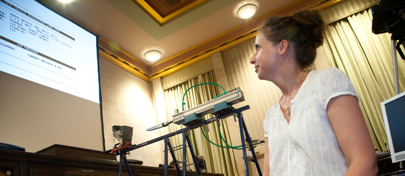
In a few weeks (late February 2019) we’ll be exploring these issues through a short early-evening workshop in Stroud: with a view to hosting a day-long data-&-art hackathon in late Spring. If you would like to find out more, drop me a line.
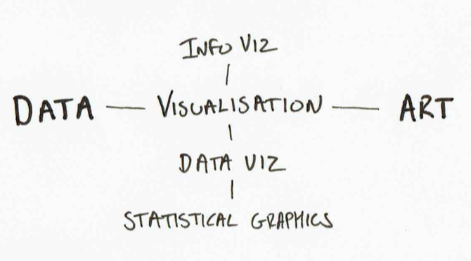
Post: Art meets data | Data meets art
For some, data and art are diametrically opposed. Data is about facts. Art about feelings.
Take a look at writings from the data visualisation community [1], and you will see some suggest that data art is just bad visualisation. Data visualisation, the argument runs, uses graphical presentation to communicate information concisely and clearly. Data art, by contrast, places beauty before functionality. Aesthetics before information.
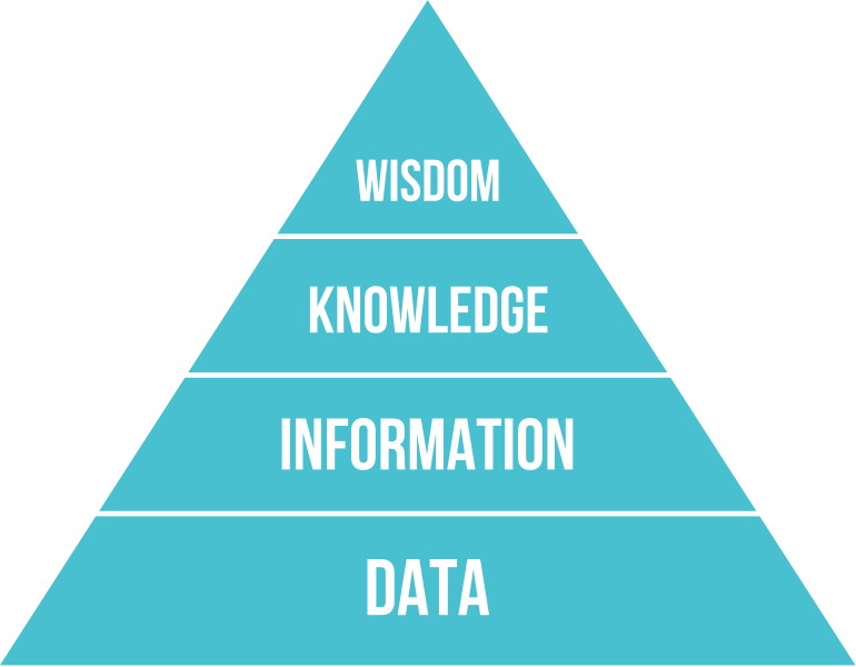
I prefer to see data, visualisation and art all as components of communication. Communication as the process of sharing information, knowledge and wisdom.
Turning data into information requires a process of organisation and contextualisation. For example, a collection of isolated facts may be made more informative when arranged into a table. That table may be made more easily intelligible when summarised through counts and averages. And it may communicate more clearly when visualisation is included.
But when seeking to communicate a message from the data, there is another contextualisation that matters: contextualising to the recipient: to what they already know, or what you may want to them to come to know. Here, the right tools may not only be those of analysis and visualisation, but also those of art: communicating a message shaped by the data, though not entirely composed of it.
In our upcoming workshop, we’ll be taking a number of datasets about the state of cultural education in Gloucestershire, and asking what they tell us. We’ll be thinking about the different ways to make sense of the data, and the ways to communicate messages from it. My hope is that we will find different ways to express the same data, looking at the same topic from a range of different angles, and bringing in other data sources of our own. In that way, we’ll be able to learn together both about practical skills for working with data, and to explore the subjects the data represents.
In preparing for this workshop I’ve been looking at ways different practitioners have connected data and art, through a range of media, over recent years.
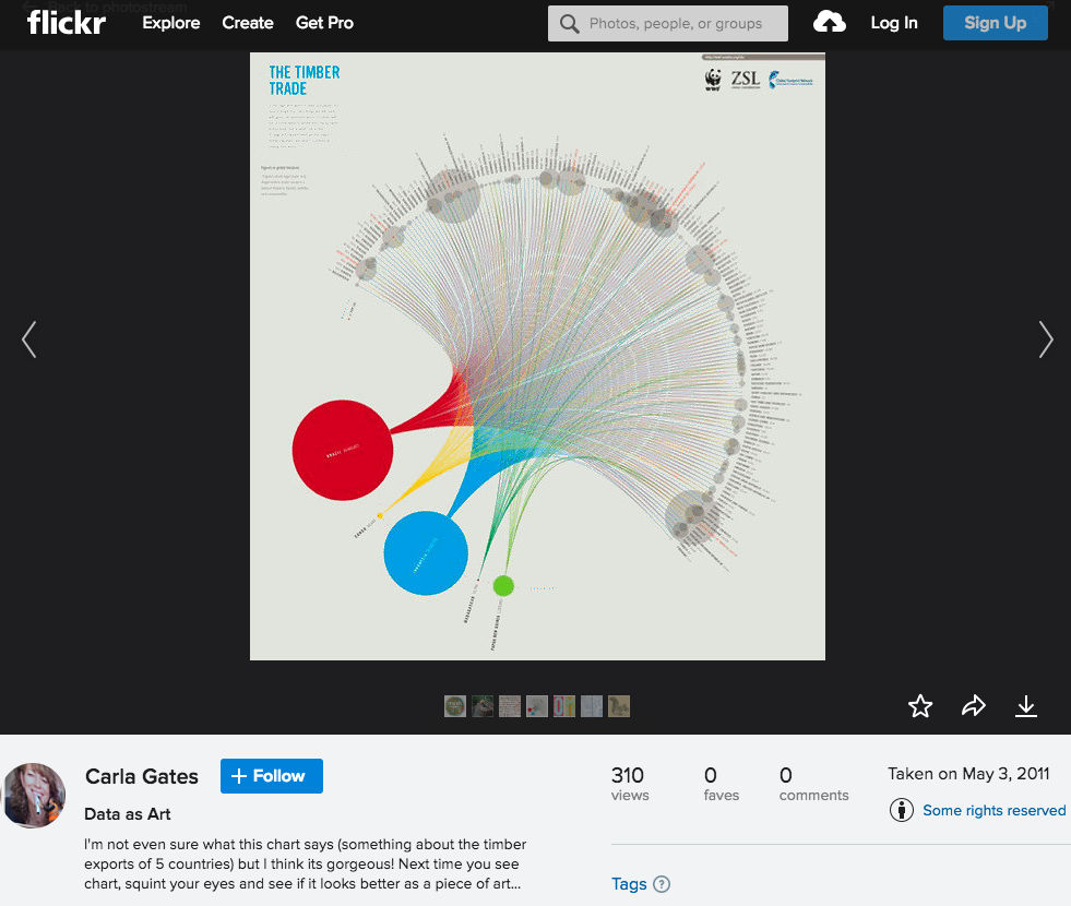
The Open Data Institute: Data as Culture
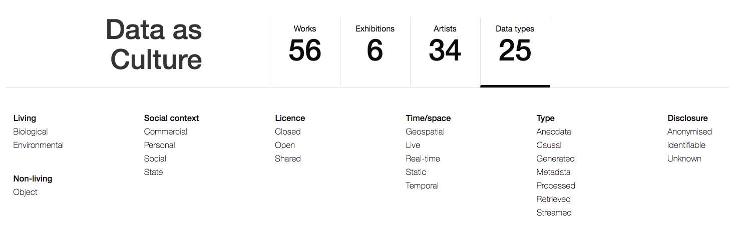
Since it’s inception, The Open Data Institute in London has run a programme called ‘Data as culture’, commissioning artists to respond to the increasing datification of society.
Some works take a relatively direct approach to representation, selecting particular streams of data from the web and using different media to represent them. Text trends, for example, selected and counterposes different google search trends on a simple graph over time. And the ODIs infamous vending machine provides free crisps in response to news media mentions of recession.
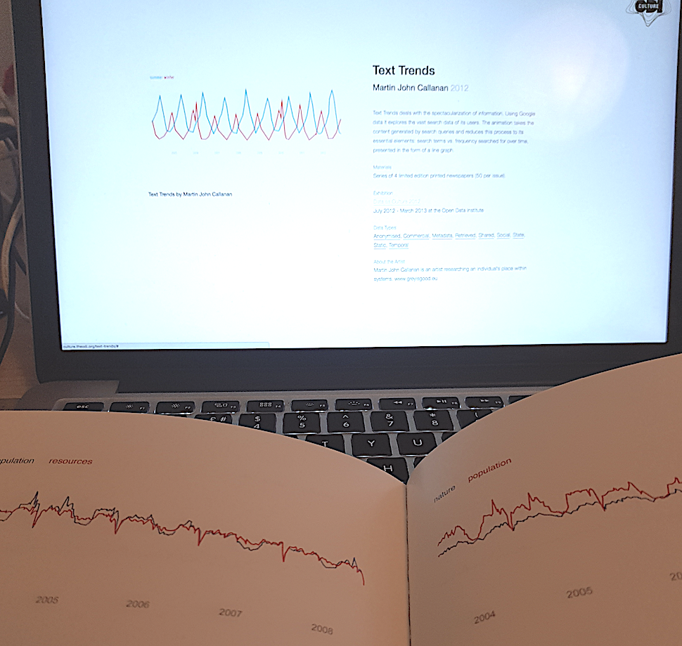
In representative works, the artist has chosen the signal to focus on, and the context in which it is presented. However, the underlying data remains more or less legible, and depending on the contextual media and the literacies of the ‘reader’, certain factual information can also be extracted from the artwork. Whilst it might be more time-consuming to read, the effort demanded by both the act of creation, and the act of reading, may invite a deeper engagement with the phenomena described by the data. London EC2 explores this idea of changing the message through changing the media: by woodblock printing twitter messages, thus slowing down the pace of social media, encouraging the viewer to rethink otherwise ephemeral information.
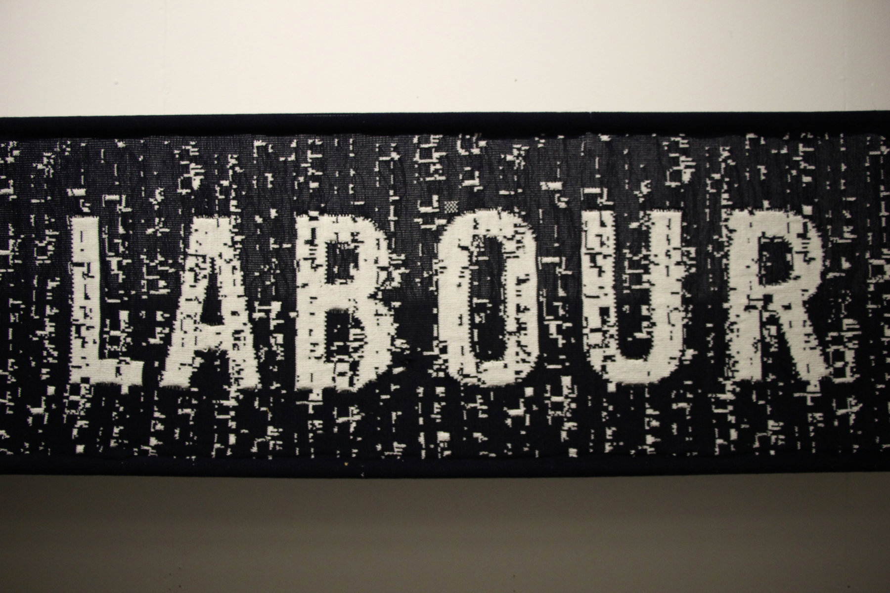
In other works that are directly driven by datasets, data is used more to convey an impression rather than to convey specific information. In the knitted Punchcard Economy banners, a representation working hours is combined with a pre-defined message resulting in data that can be read as texture, more than it can be read as pattern. In choosing how far to ‘arrange’ the data, the work finds its place on a spectrum between visualisation or aesthetic organisation.
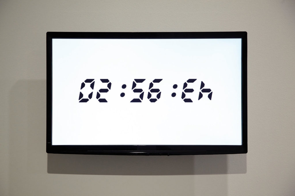
Other works in the data as culture collection start not from datasets, but from artists responses to wider trends of datification. Works such as metography, flipped clock and horizon respond to forms of data and it’s presentation in the modern world, raising questions about data and representation – but not necessarily about the specific data which happens to form part of the work.
Other works still, look for the data within art, such as pixelquipu which takes it’s structure from pre-Columbian quipu (necklace-shaped, knotted threads from the Inca empire, that are thought to contain information relating to calendars and accounting in the empire). In these cases, turning information into data, and then representing it back in other way, is used to explore patterns that might not have otherwise been visible.
YoHa: Invisible Airs
Although it has also featured in the ODI’s Data as Culture collection, I want to draw out and look specifically at YoHa’s ‘Invisible Airs’ project. Not least because it was the first real work of ‘open data art’ I encountered, stumbling across it at an event in Bristol.
It is a hard project to describe, but fortunately YoHa have a detailed project description and video on their website, showing the contraptions (participatory kinetic sculptures?) they created in 2014, driven by pneumatic tubes and actuated by information from Bristol City Council’s database of public spending.
In the video, Graham Harwood describes how their different creations (from a bike seat that rises up in response to spending transactions, to a pneumatic knife stabbing a book to highlight library service cuts) seek to ‘de-normalise’ data, not in the database designers sense of finding a suitable level of data abstraction, but in the sense of engaging the participant to understand otherwise dry data in new ways. The learning from the project is also instructive: in terms of exploring how far the works kept the attention of those engaging with them, or how far they were able to communicate only a conceptual point, before viewers attention fell away, and messages from the underlying data were lost.
Ultimately though, Invisible Airs (and other YoHa works engaging with the theme of data) are not so much communicating data, as communicating again about the role, and power, of data in our society. Their work seeks to bring databases, rather than the individual data items they contain, into view. As project commissioner Prof Jon Dovey puts it, “If you are interested in the way that power works, if you are interested in the way that local government works, if you are interested in the way that corporations work, if you are interested in the way that the state works, then data is at the heart of it…. The way your council tax gets calculated… the way your education budget gets calculated, all these things function through databases.”
Everyday data arts
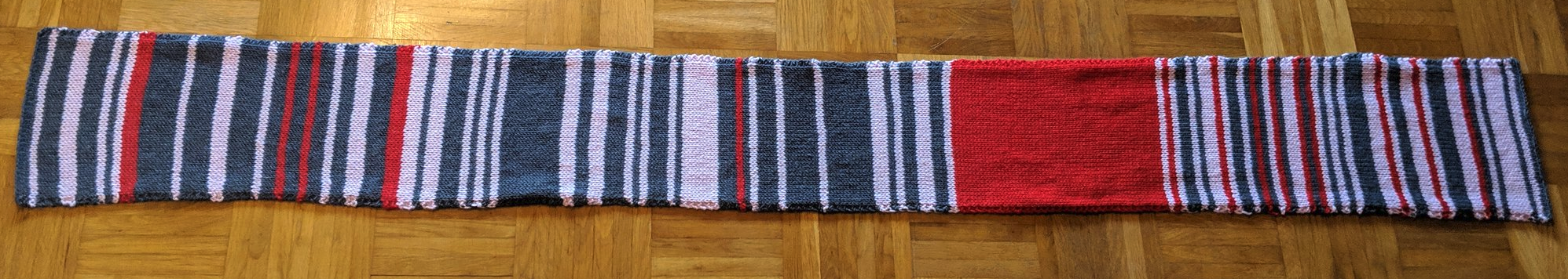
Data as art need not involve costly commissions. For example, the media recently picked up on the story of a german commuter who had knitted a ‘train-delay scarf’, with choice of wool and colour representing length of delays. The act of creating was both a means to record, and to communicate, and in the process communicate much more effectively than the same data might have done if simply recorded in a spreadsheet, or even placed onto a chart with data visualisation.
Data sculpture and data-driven music
In a 2011 TED Talk, Nathalie Miebach has explored both how weather data can be turned into a work of art through sculpture and music, as well as questioning how the setting in which the resulting work is show affects how it is perceived.
She describes the creation of a vocabulary for turning the data into a creative work, but also the choice of a media that is not entirely controlled by the data, such that the resulting work is not entirely determined by the data, but also by its interaction with other environmental factors.
Dance your PhD, and dancing data
When reflecting on data and art, I was reminded of the annual Dance your PhD competition. Although the focus is more on expressing algorithms and research findings, than underlying datasets, it offers a useful way to reflect on ways to explain data, not only express what it contains.
In a similar vein, AlgoRythmics explain sorting algorithms using folk dance – a playful way of explaining what’s going on inside the machine when processing data.
There is an interesting distinction though between these two. Whilst Dance your PhD entries generally ‘annotate’ the dance with text to explain the phenomena that the dance engages with audience with, in AlgoRythmics, the dance itself is the entirety of the explanation.
Visualisation
The fields of InfoViz and DataViz have exploded over the last decade. Blog such as InformationIsBeautiful, Flowing Data and Visualising Data provide a regular dose of new maps, charts and novel presentation of data. However, InfoViz and DataViz are not simply synonyms: they represent work that starts from different points of a Data/Information/Knowledge model, and with often different goals in mind.
Take, for example, David McCandless’ work in the ‘Information in Beautiful’ book (also presented in this TED Talk). The images, although often based on data, are not a direct visualisation of the data, but an editorialised story. The data has already been analysed to identify a message before it is presented through charts, maps and diagrams.
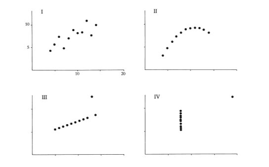
By contrast, in Edward Tufte’s work on data visualisation, or even statistical graphics, the role of visualisation is to present data in order to support the analytical process and the discovery of information. Tufte talks of ‘the thinking eye’, highlighting the way in which patterns that may be invisible when data is presented numerically, can become visible and intelligible when the right visual representation is chosen. However, for Tufte, the idea of the correct approach to visualisation is important: presenting data effectively is both an art and a technical skill, informed by insights and research from art and design, but fundamentally something that can be done right, or done wrong.
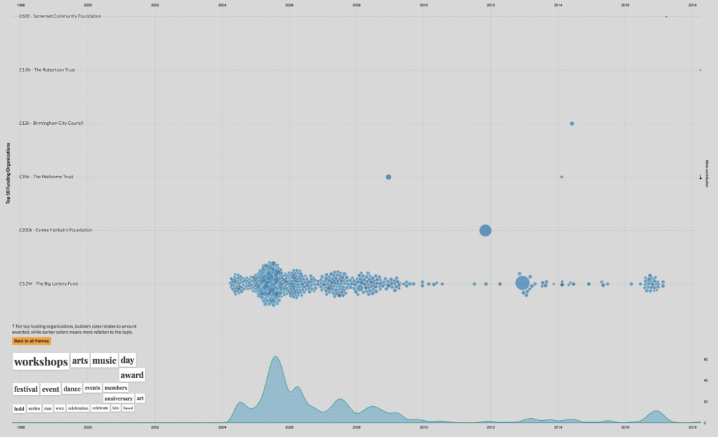
Other data visualisation falls somewhere between the extremes I’ve painted here. Exploratory data visualisations can seek to both support analysis, but also to tell a particular story through their selection of visualisation approach. A look at the winners of the recent 360 Giving Data Visualisation Challenge illustrates this well. Each of these visualisation draws on the same open dataset about grant making, but where ‘A drop in the bucket’ uses a playful animation to highlight the size of grants from different funders, Funding Themes extracts topics from the data and presents an interactive visualisation, inviting users to ‘drill down’ into the data and explore it in more depth. Others, like trend engine use more of a dashboard approach to present data, allowing the user to skim through and find, if not complete answers, at least refined questions that they may want to ask of the raw dataset.
Arts meet data | Data meet arts | Brokering introductions
Writing this post has given me a starting point to explore some data-art-dichotomies and to survey and link to a range of shared examples that might be useful for conversations in the coming weeks.
It’s also sparked some ideas for workshop methods we might be able to use to keep analytical, interpretative and communicative modes in mind when planning for a hackathon later this year. But that will have to wait for a future post…
Footnotes
[1]: I am overstating the argument in the blog post on art and data visualisation slightly for effect. The post, and comments in fact offer a nuanced dialogue worth exploring on the relationship of data visualisation and art, although still seeking to draw a clear disjunct relationship.
Re-reading this, and reflecting on the Creative Lab we held[1], I realise my starting position within a data community led me to neglect the vital aspect of art in not only ‘communicating information’, but in ‘inviting questions, and exploration’.
Above I’ve implicitly assumed a process in which the artist identifies a more-or-less defined message from data, and creates works that invite engagement with that message. Yet, messages can emerge from the creative process, rather than being prior to it – and arts works can create a process for the viewer/audience that takes them on a journey through data-inspired questions, rather than towards data-driven answers.
[1]: http://www.timdavies.org.uk/2019/09/28/creative-lab-report-data-culture-learning/