[Summary: report from a one day workshop with Create Gloucestershire bringing together artists and technologists to create artworks responding to data. Part 2 in a series with Exploring Arts Engagement with (Open) Data]
What happens when you bring together a group of artists, scientists, teachers and creative producers, with a collection of datasets, and a sprinkling of technologists and data analysts for a day? What will they create? What can we learn about data through the process?
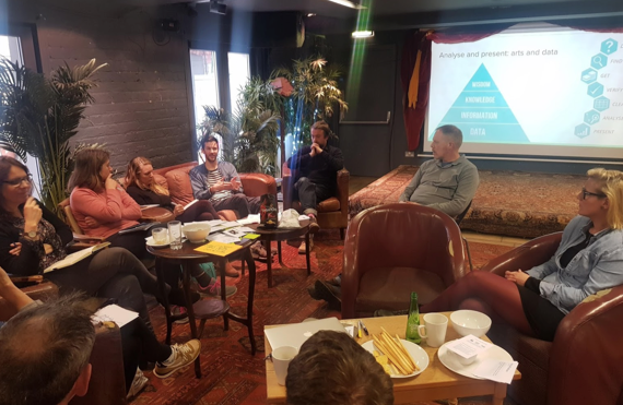
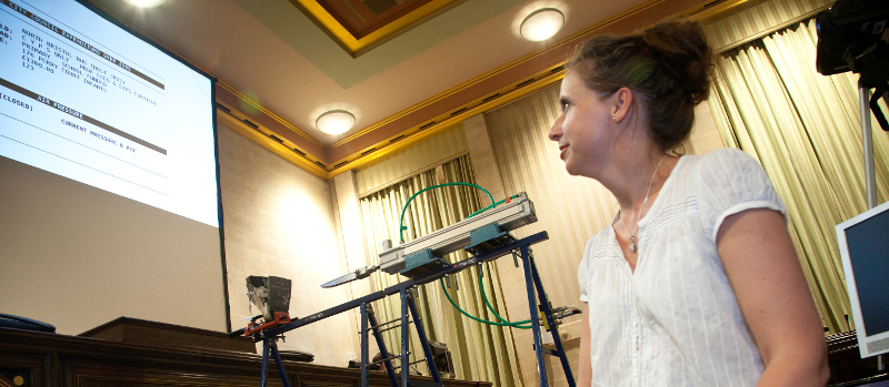
There has been a long trend of data-driven artworks, or individual artists incorporating responses to structured data in their work. But how does this work in the compressed context of a one-day collaborative workshop? These are all questions I had the opportunity to explore last Saturday in a workshop co-facilitated with Jay Haigh of Create Gloucestershire and hosted at Atelier in Stroud: an event we ran under the title “Data | Create | Learning: Creative Lab”
The steady decline in education spending and increased focus on STEM subjects has impacted significantly on arts teaching and teachers. The knock on effect is observed in the take up of arts subjects at secondary, further and higher education level and, ultimately, impacting negatively on the arts and cultural sector in the UK. As such, Create Gloucestershire has been piloting new work in Gloucestershire schools to embed new creative curriculum approaches, supporting its mission to ‘make arts everyday for everyone’. The cultural education agenda therefore provided a useful ‘hook’ for this data exploration.
Data: preparation
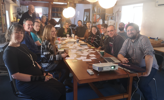
We started thinking about the idea of a ‘art and data hackathon’ at the start of this year, as part of Create Gloucestershire’s data maturity journey and decided to focus on questions around cultural education in Gloucestershire. However, we quickly realised an event could not be entirely modelled on a classic coding hackathon event, so, in April we brought together a group of potential participants for a short design meeting.
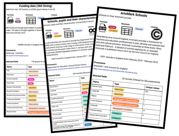
For this, we sought out a range of datasets about schools, arts education, arts teaching and funding for arts activities – and I worked to prepare Gloucestershire extracts of these datasets (slimming them down from hundreds of columns and rows) . Inspired by the Dataset Nutrition Project project, and using AirTable blocks to rapidly create a set of cards, we took along profiles of some of these datasets to help give participants at the planning meeting a sense of what might be found inside each of the datasets we looked at.
Through this planning meeting we were able to set our expectations about the kind of analysis and insights we might get to from these datasets, and to think about placing the emphasis of the day on collaboration and learning, rather than being overly directive about the questions to be answered with data. We also decided that, in order to help collaborative groups form in the workshop, and to make sure we had materials prepared for particular art forms, we would invite a number of artists to act as anchor facilitators on the day.
Culture: the hackathon day
After an overview of Create Gloucestershire’s mission to bring about ‘arts everyday for everyone’, we began with introductions, going round the group and completing three sentences:
- For me, data is…
- For me, arts everyday is…
- In Gloucestershire, is arts everyday….?
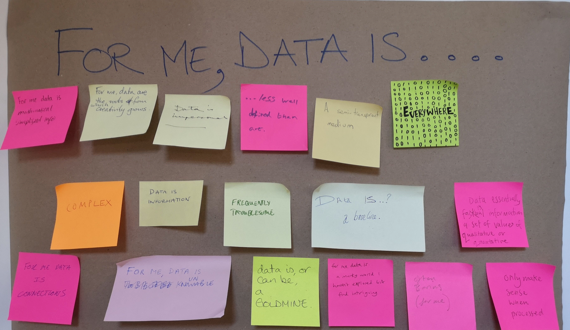
Through this, we began to surface different experiences of engagement with data (everywhere; semi-transparent; impersonal; information; a goldmine; less well defined than art; complex; connective…), and with questions of access to arts (Arts everyday is: fun; making sense of the world; what you make of it; necessary; a privilege for some; an improbable dream; essential).
We then turned briefly to look at some of the data available to explore these questions, before inviting our artists to explain the tools and approaches they had brought along to share:
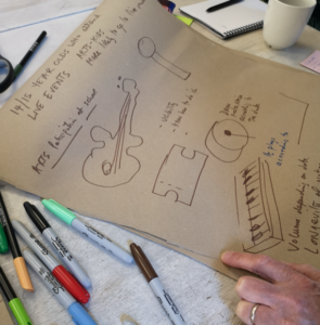
- Barney Heywood of Stand + Stare demonstrated use of touch-sensitive tape to create physical installations that respond to an audience with sound or visuals, as well as the Mayfly app that links stickers and sounds;
- Illustrator and filmmaker, Joe Magee described the power of the pen, and how to sketch out responses to data;
- Digital communications consultant and artist, Sarah Dixon described the use of textiles and paper to create work that mixes 2D and 3D; and
- Architect Tomas Millar introduced a range of Virtual Reality technologies, and how tools from architecture and gaming could be adapted to create data-related artworks.
To get our creative ideas flowing, we then ran through some rapid idea generation, with everyone rotating around our four artists groups, and responding to four different items of data (below) with as many different ideas as possible. From the 30+ ideas generated came some of the seeds of the works we then developed during the afternoon.
Following a short break, everyone had the chance to form groups and dig deeper into designing an artwork, guided by a number of questions:
- What response to data do group members want to focus on? Collecting data? Data representation? Interpretation and response? Or exploring ‘missing data’?
- Is there a story, or a question you want to explore?
- Who is the audience for your creation?
- What data do you need? Individual numbers; graphs; tables; geo data; qualitative data; network data or some other form?
Groups then had around three hours to start making and creating prototype artworks based on their ideas, before we reconvened for a showcase of the creations.
The process was chaotic and collaborative. Some groups were straight into making: testing out the physical properties of materials, and then retrofitting data into their works later. Others sought to explore available datasets and find the stories amongst a wall of statistics. In some cases, we found ourselves gathering new data (e.g. lists of extracurricular activities taken from school websites), and in others, we needed to use exploratory data visualisation tools to see trends and extrapolate stories that could be explored through our artforms. People moved between groups to help create: recording audio, providing drawings, or sharing skills to stimulate new ways of increasing access to the stories within the data. Below is a brief summary of some of the works created, followed by some reflections on learning from the day.
The artworks
Interactive audio: school subjects in harmony
Responding to questions about the balance of the school curriculum, and the low share of teaching hours occupied by the arts, the group recorded a four-part harmony audio clip, and set the volume of each part relative to the share of teaching time for arts, english, sciences and humanities. Through a collection of objects representing each subject, audiences could trigger individual parts, all four parts together, or a distorted version of the harmony. Through inviting interaction, and using volume and distortion, the piece invited reflection on the ‘right’ balance of school subjects, and the effect of loosing arts from the curriculum for the overall harmony of education.
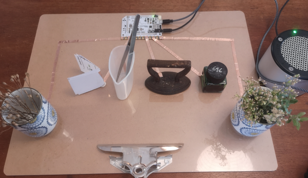
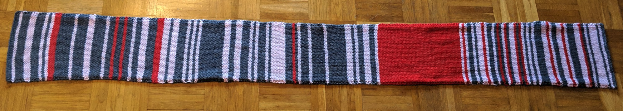
Fabric chromatography: creative combinations
Picking up on a similar theme, this fabric based project sought to explore the mix of extracurricular activities available at a school, and how access to a range of activities can interact to support creative education. Using strips of fabric, woven in a grid onto a backcloth, the work immersed a dangling end of each strip in coloured ink, the mix of inks depending on the range of arts activities available at a particular school. As the ink soaked up vertical strands of the fabric, it also started to seep into horizontal strands, which could mix with other colours. The colours chosen reflected a chart representation of the dataset used to inform the work, establishing a clear link between data, information, and art work.
This work offered a powerful connection between art, data and science: allowing an exploration of how the properties of different inks, and different fabrics, could be used to represent data on ‘absorption’ of cultural education, and the benefits that may emerge from combining different cultural activities. The group envisaged works like this being developed with students, and then shown in the reception area of a school to showcase it’s cultural offer.
The shrinking design teacher (VR installation)
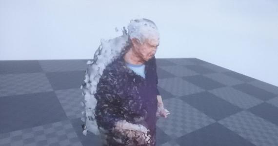
Using a series of photographs taken on a mobile phone, a 3D model of representation of Pip, a design teacher, was created in a virtual landscape. An audio recording of Pip describing the critical skill sets engendered through design teaching was linked to the model, which was set to shrink in size over the time of the recording reflecting 7-years of data on the reduction in design teaching hours in school.
Observed through VR goggles, the piece offered an emotive way to engage with a narrative on the power of art to encourage critical questioning of structures, and to support creative engagement with the world, all whilst – imperceptibly at first, and more clearly as the VR observer finds themselves looking down at the shrinking teacher – highlighting current trends in teaching hours.
Arcade mechanicals
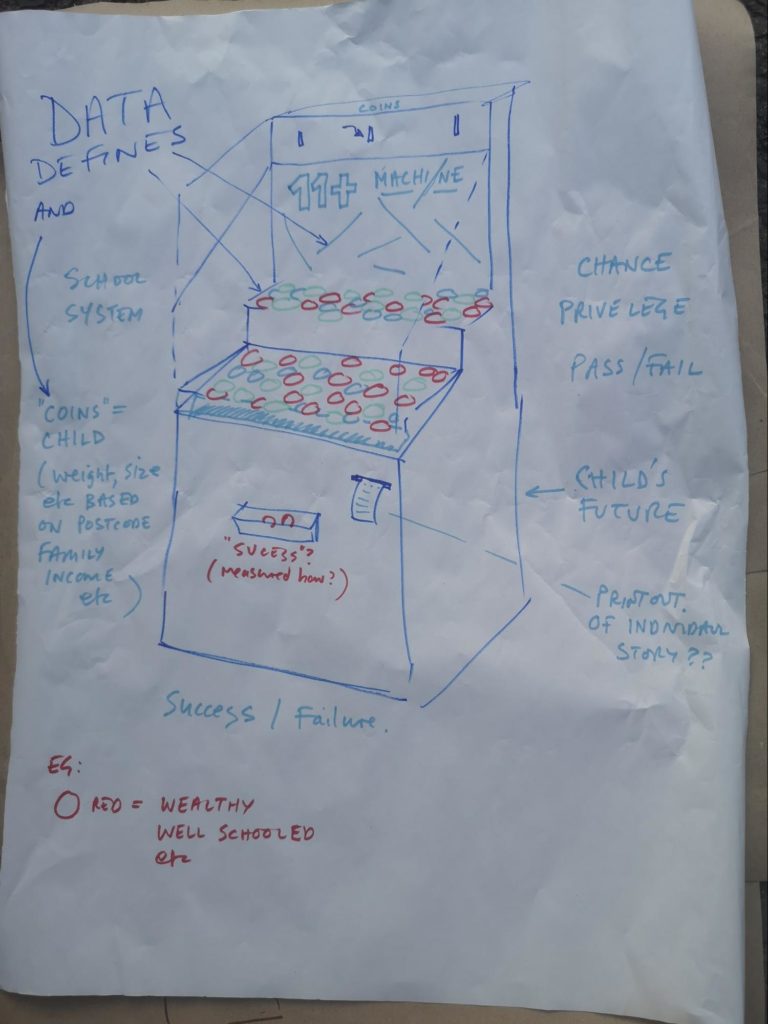
From the virtual to the physical, this sketch questioned the ‘rigged’ nature of grammar school and private education, imagining an arcade machine where the weight, size and shape of tokens were set according to various data points, and where the mechanism would lead to certain tokens having a better chance of winning.
By exploring a data-informed arcade mechanisms, this idea captures the idea that statistical models can tell us something about potential future outcomes, but that outcomes are not entirely determined, and there are still elements of chance, or unpredictable interactions, in any individual story.
Exclusion tags
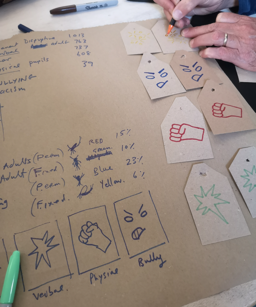
Building on data about different reasons for school exclusion, eight workshop participants were handed paper tags, marking them out for exclusion from the ‘classroom’. They were told to leave the room, where the images on their tags were scanned (using the Mayfly app) playing them a cold explanation of why they have been excluded and for how long.
The group were then invited to create a fabric based sculpture to represent the percentage of children excluded from school in Gloucestershire for the reasons indicated on their tag.
The work sought to explore the subjective experience of being excluded, and to look behind the numbers to the individual stories – whilst also prototyping a possible creative yarn-bombing workshop that could be used with excluded young people to re-engage them with education.
The team envisaged a further set of tags linked to personal narratives collected from young people excluded from school, bringing their voices into the piece to humanise the data story.
Library lights: stories from library users
This early prototype explored the potential VR to let an audience explore a space, shedding light on areas that are otherwise in darkness. Drawing on statistics about the fact that 33% of people use libraries, and on audio recordings – drawn from direct participant quotes collected by Create Gloucestershire during their 3-year Art of Libraries test programme describing how people benefitted from engagement with arts interventions in libraries across Gloucestershire – a virtual space was populated with 100 orbs – the percentage lit relating to those who use libraries. As the audience in VR approached a lit orb, an audio recording of an individual experience with a library would play.
The creative team envisaged the potential to create a galaxy of voices: offseting negative comments about libraries from those that don’t use them (they were able to find a significant number of data sets showing negative perceptions about libraries, but few positive ones) with the good experiences of those that do.
Artwork: Tomas Millar and team (image to come)
Seeing our networks
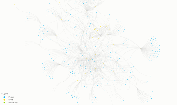
Not so much an artwork, as a data visualisation, this piece took data gathered over the last five years by Create Gloucestershire to record attendance at Create Gloucestershire events. Adding in data on attendance at the Creative Lab, lists of people, events and event participation (captured and cleaned up using the vTiger CRM), were fed into Kumu, and used to build an interactive network diagram. The visual allows an identification of how, over time, CG events have both engaged with new people (out on the edge of the network), and have started to build ongoing connections.
A note on naming
*One things we forgot to do (!) in our process was to ask each group to title their works, so the titles and descriptions above are given by the authors of this post. We will happily amend with input from each group.
Learning
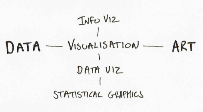
We closed our workshop reflecting on learning from the day. I was particularly struck by the way in which responding to dataset through the lens of artistic creation (and not just data visualisation) provided opportunities to ask new questions of datasets, and to critically question their veracity and politics: digging into the stories behind each data point, and powerfully combining qualitative and quantitative data to look not just at presenting data, but finding what it might mean for particular audiences.
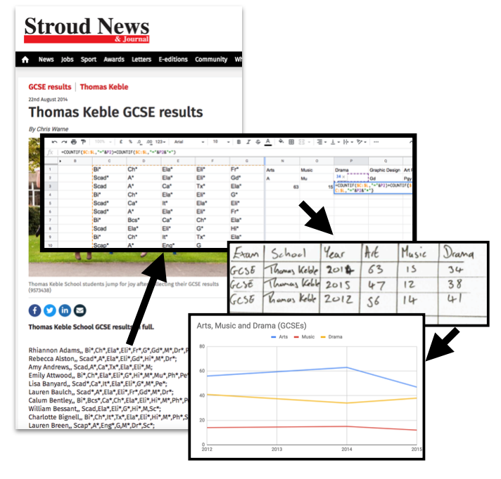
However, as Joe Magee framed it, it wasn’t always easy to find a route up the “gigantic data coalface”. Faced with hundreds of rows and columns of data, it was important to have access to tools and skills to carry out quick visualisations: yet knowing the right tools to use, or how to shape data so that it can be easily visualised, is not always straightforwards. Unlike a classic data hackathon, where there are often demands for the ‘raw data’, a data and art creative lab benefits from more work to prepare data extracts, and to provide access to layers of data (individual data points, a small set they belong in, the larger set they come from) .
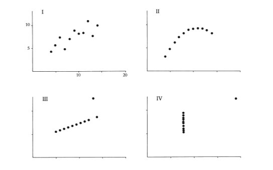
Our journey, however, took use beyond the datasets we had pre-prepared. One particular resource we came across was the UK Taking Part Survey which offers a range of analysis tools to drill down into statistics on participation in art forms by age, region and socio-economic status. With this dataset, and a number of others, our expectations were often confounded when, for example, relationships we had expected to find between poverty and arts participation, or age and involvement, were not borne out in the data.
This points to a useful symmetry: turning to data allowed us to challenge the assumptions that might otherwise be baked into an agenda-driven artwork, but engaging with data through an arts lens also allowed us to challenge the assumptions behind data points, and behind the ways data is used in policy-making.
We’ve also learnt more about how to frame an event like this. We struggled to describe it in advance and to advertise it. Too much text was the feedback from some! Now with images of this event, we can think about ways to provide a better visual story for future workshops of what might be involved.
Given Create Gloucestershire’s commitment to arts everyday for everyone as a wholly inclusive statement of intent, it was exciting to see collaborators on the day truly engaging with data in a way they may not have done previously, and then expanding access to it by representing data in accessible and engaging forms which, additionally, could be explored by subjects of the data themselves. What might have seemed “boring” or “troublesome” at the start of the day become a font of inspiration and creativity, opening up new conversations that may never have previously taken place and setting up the potential for new collaborations, conversations, advocacy and engagement.
Thanks
Thank you to the team at Create Gloucestershire for hosting the day, and particularly to Caroline, Pippa and Jay for all the organisation. Thanks to Kat at Atelier for hosting us, and to our facilitating artists: Barney, Sarah, Thomas and Joe. And thanks to everyone who gave up a Saturday to take part!
Photo credit where not stated: Jay Haigh